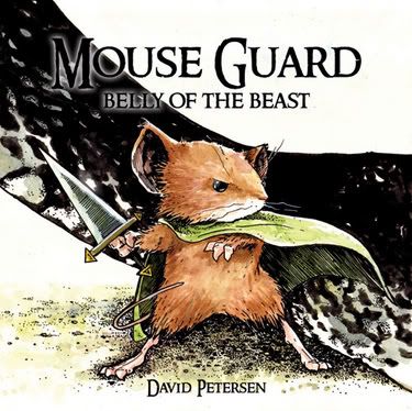
Mouse Guard #1: Book of the Week
I had half this review typed and smokin' hot last night when I "accidentally" closed the program and lost everything. Let this be a warning: don't use the red "X" box to close your fucking programs. I know it looks like you've got Windows Media Player "on top," but you're wrong.
*****
Too often, it seems, I find a new book that I get really excited about, reading preview after interview after etc., etc., and when the damn thing finally comes out and I go to the store and buy it, somewhere between my misplaced expectations and (perhaps) a less-than-stellar performance on the part of the creator(s), the whole thing just kinda falls a bit flat.
Mouse Guard #1 represents a marvelous success on the parts of both writer/artist David Petersen and myself.

I'll get the self-congratulation right out of the way: I did this one right. The cover art for issue two caught my eye in a big way. I read the high concept, looked at two of the fifteen or so preview pages available on the website, e-mailed my LCS to have them stash a copy of issue #1, started a quick MillarWorld thread to let some other folks know how psyched I was, and stopped. No speculation, no looking for interviews or big fat previews - sometimes that stuff is really nice, but sometimes it just gives too much away. I start imagining the book in my own mind, the way I would make it, and then the read just gets fucked up.
So, the issue came and I read it yesterday and then made Molly read it and then read it two more times.
I loved it.
There's a certain level of craft unavailable to writer/artist teams, a cohesion between the concept and the presentation, that really shines when a single person is behind the whole product; David Petersen looks to be a major new talent on the field, a storyteller who realizes and takes firm grasp of the power of comics to communicate beyond the scripted lines. Don't get me wrong - this isn't a silent comic at all, and the scripting is solid - but the real gutpunch behind this comic, to me, is the ability of the artwork to communicate subtle story points. Take, for example, this page, which introduces the three main characters:

The artwork is gorgeous, yes - that's the most obvious and immediate thing about the book - but unlike many artists with this level of aesthetic talent, Petersen includes in every panel a key part of the ongoing story. Nothing here is pretty just for pretty's sake; it's all functional. In the page above, we're given visual cues that lead to a quick understanding of each character. Lieam, on the right, is wide-eyed, with his face turned upward - a young, stout-hearted but very green soldier, eager to learn and make good. Kenzie, in the middle, is the tallest of the three, carries a stick rather than a blade, and has grey fur - the wise and experienced leader, the thinker, the glue that holds the trio together. And Saxon, on the right, is the shortest of the three, with a pissed-off expression in his eyes and his fist on the hilt of his sword - a scrappy taker of action, the first one to get into trouble but the last one you'd look at sideways.
Funny thing is, I got all these ideas just looking at the page - the personalities are developed, of course, as the issue goes on, but we're given a cue like this in almost all of the artwork here. It makes each page a satisfying experience, because you want to spend some time just soaking in how beautiful it looks, but at the same time you realize you're absorbing more subtle elements of the story itself. It's a guilty pleasure without the guilt.
The plotting is excellent, and takes full advantage of the format in which Petersen's telling the story - we're given a full adventure that introduces the characters and puts them through a dramatic trial, and left off with a cliffhanger that opens the series to a much larger story. It's episodic storytelling as only a handful of writers in comics have managed in recent memory, and it makes the hard-earned coin I plunked down for the issue feel well-spent.
This really is a spectacular launch, and I'm already hungry for more. Cheers to David Petersen for creating such an accessible, rewarding comic, and to Archaia Studios Press for bringing it to me. Bless you all - between this, and first-rate issues this week of The Thing and Lucifer (and, actually, Ultimate Wolverine vs. Hulk), I'm juiced as fuck about comics today.
*****
Too often, it seems, I find a new book that I get really excited about, reading preview after interview after etc., etc., and when the damn thing finally comes out and I go to the store and buy it, somewhere between my misplaced expectations and (perhaps) a less-than-stellar performance on the part of the creator(s), the whole thing just kinda falls a bit flat.
Mouse Guard #1 represents a marvelous success on the parts of both writer/artist David Petersen and myself.

I'll get the self-congratulation right out of the way: I did this one right. The cover art for issue two caught my eye in a big way. I read the high concept, looked at two of the fifteen or so preview pages available on the website, e-mailed my LCS to have them stash a copy of issue #1, started a quick MillarWorld thread to let some other folks know how psyched I was, and stopped. No speculation, no looking for interviews or big fat previews - sometimes that stuff is really nice, but sometimes it just gives too much away. I start imagining the book in my own mind, the way I would make it, and then the read just gets fucked up.
So, the issue came and I read it yesterday and then made Molly read it and then read it two more times.
I loved it.
There's a certain level of craft unavailable to writer/artist teams, a cohesion between the concept and the presentation, that really shines when a single person is behind the whole product; David Petersen looks to be a major new talent on the field, a storyteller who realizes and takes firm grasp of the power of comics to communicate beyond the scripted lines. Don't get me wrong - this isn't a silent comic at all, and the scripting is solid - but the real gutpunch behind this comic, to me, is the ability of the artwork to communicate subtle story points. Take, for example, this page, which introduces the three main characters:

The artwork is gorgeous, yes - that's the most obvious and immediate thing about the book - but unlike many artists with this level of aesthetic talent, Petersen includes in every panel a key part of the ongoing story. Nothing here is pretty just for pretty's sake; it's all functional. In the page above, we're given visual cues that lead to a quick understanding of each character. Lieam, on the right, is wide-eyed, with his face turned upward - a young, stout-hearted but very green soldier, eager to learn and make good. Kenzie, in the middle, is the tallest of the three, carries a stick rather than a blade, and has grey fur - the wise and experienced leader, the thinker, the glue that holds the trio together. And Saxon, on the right, is the shortest of the three, with a pissed-off expression in his eyes and his fist on the hilt of his sword - a scrappy taker of action, the first one to get into trouble but the last one you'd look at sideways.
Funny thing is, I got all these ideas just looking at the page - the personalities are developed, of course, as the issue goes on, but we're given a cue like this in almost all of the artwork here. It makes each page a satisfying experience, because you want to spend some time just soaking in how beautiful it looks, but at the same time you realize you're absorbing more subtle elements of the story itself. It's a guilty pleasure without the guilt.
The plotting is excellent, and takes full advantage of the format in which Petersen's telling the story - we're given a full adventure that introduces the characters and puts them through a dramatic trial, and left off with a cliffhanger that opens the series to a much larger story. It's episodic storytelling as only a handful of writers in comics have managed in recent memory, and it makes the hard-earned coin I plunked down for the issue feel well-spent.
This really is a spectacular launch, and I'm already hungry for more. Cheers to David Petersen for creating such an accessible, rewarding comic, and to Archaia Studios Press for bringing it to me. Bless you all - between this, and first-rate issues this week of The Thing and Lucifer (and, actually, Ultimate Wolverine vs. Hulk), I'm juiced as fuck about comics today.

1 Comments:
At 10:53 AM, Gerbil Knitting said…
I love this comic also. I got all the issues so far. I can't believe how popular this comic has become.
Post a Comment
<< Home