Promotions Week, day two: The Adventures of Bio Boy
So, yesterday I looked at advance reviews, and wrote one of my own based on an advance preview Jay Faerber sent me through the internet.
Seems like it makes sense, today, to talk about Internet Previews that we all get to see.
Folks handle online previews a number of different ways; sometimes they just put up a cover to an issue, sometimes it's concept art or character sketches, sometimes it's final art pages (with and without lettering) and, occasionally, an entire issue of a comic will be made available online.
The effectiveness of this marketing tool depends largely, I think, on context. If I haven't heard of your book, your publisher, or any of your creative team, it might be hard to convince me to read a full issue of your comic on my computer. Reading comics on the computer can be a pain in the ass; scrolling down the pages just doesn't feel right. Sometimes I have to squint to read the lettering. And sometimes, if I read the whole issue online, the desire to actually buy it can diminish even if I liked it.
So, three pieces of advice to folks using online previews as a marketing tool:
1. Tailor the size of your preview to the awareness of your book that already exists. If you've got one or two really well known creators, you're not going to need a lot more than a cover and maybe one or two pages or sketches to really get me interested. Likewise, if you're brand new and there's no pre-existing reason for me to care about your book, make it concise - show me your chops, use your most exciting pages, but make the point as quickly as possible and then get out of the way - I've got an Ed Brubaker interview or something to read. If, however, you're right on the cusp, a new creative team building some decent buzz and someone sends me your way with a curious (or skeptical) look on my face, it might make sense to show off a little more, hit me with several pages in a row to show how you tell your stories.
2. Be careful of making too much available. It makes sense, for example, for Elk's Run #1 to be available in its entirety, because it's long since sold out at Diamond and it makes up just a third of the Bumper edition coming from Speakeasy. You wouldn't want to do that with a book that's still available for me to buy, because once I've read it, I'm largely finished with it - I don't re-read very many comics, unless they're really top notch. Also be aware of whether you want to appeal to folks with a dial-up connection (like mine). I know we're backwoods cavemen, but we still have money to spend, so take it easy on the file sizes, if you can do that without sacrificing too much quality.
3. Pay a lot of attention to the quality of the files you post. I know you've busted your ass on the pages themselves, but if the images on my computer are too big for me to download or too small to read the lettering, I'm gonna get frustrated and click that little "X" at the top right corner. I've seen a lot of publishers do this wrong, and it's really lame.
I was going to use Fear Agent as a specific example, seeing all the coverage it got on CBR last week, but I realized that would be a cheat - I knew I was picking this book up months ago. Tony Moore interiors with Lee Loughridge colors, written by Rick Remender on a crusade to make sci-fi comics badass again? Christ, there's no passing that up.
So I found a book that fits the criteria I listed above pretty damn well. It's called The Adventures of Bio-Boy, and it's coming out in September from Speakeasy.
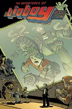
The context here, then, is that Speakeasy has been grabbing my attention from the sidelines lately, picking up a couple books I was already reading (Elk's Run and Helios) and launching a really promising new title just two weeks ago (Rocketo). So I'm getting kinda interested in what these folks have lined up, but I don't know much about their direction just yet.
And then I find this preview up on Newsarama; it's got the cover to the first issue and ten lettered pages of artwork - it also mentions that the series is drawn by the guy who did NYC Mech, and I remember liking the artwork when I flipped through those comics. The link to the page mentions Speakeasy, which grabs my attention, and then the size of the preview fits pretty well with what time I'm ready to spend.
So I read through the ten pages. They're sized pretty well, easy for my sorry 56K modem to download, and they're pretty easy to read. The lettering's just a tad small, but it's not nearly enough to really annoy me, and the pages have some jump and dance to them, so I'm mostly just enjoying the layouts and inking anyway.
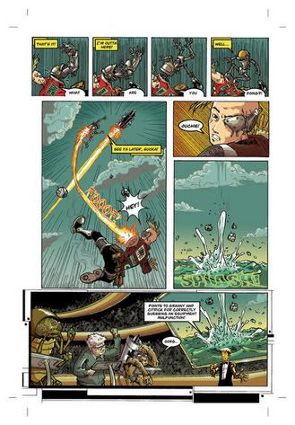
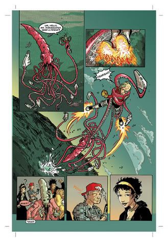
So, I finish reading all ten pages and I know this about the book:
* It's got some kind of gameshow, Running Man-style premise where contestants get points for predicting the awful shit that will come Our Hero's way.
* Our Hero is a young boy, maybe 12 or 14 years old, and he's got a robot arm that separates from his body and sabotages his efforts to survive the perils thrown his way (which include a giant squid and a bunch of hip hop demon checks called Latihfans)
* There are some funny lettering/translation gags with one of the alien contestants.
* I really like Our Hero so far; he seems confident and well-humored, and a little cocky. I'm put in mind of the characterization of Mark in the early issues of Invincible (that's two unrelated mentions in two days!).
* As I mentioned above, I like the layouts and the inking style. The pages have a cock-eyed angle and a frenetic pace that suits the story so far. It might get to be a bit much if the series is nothing but these kinds of scenes, but I've got a feeling there's a back-story we'll get to - it just wouldn't have made good Internet Preview material. (Smart choice, I think, to drop us right in the middle of the action.)
* I think it's worth $2.95 to find out if this series is any good, because it looks like it might be.
Right there, then, is an effective use of internet previews. Maybe my standards are different from yours - hell, they almost certainly are - but there they are, for what it's worth.
P.S. - Y'all probably already all check Newsarama and Comic Book Resources and Comicon PULSE for preview material, but have you noticed how many previews Blair Marnell has been snatching up for All The Rage every week? Just this past Sunday, he had a bunch of pages of Image's upcoming The Long, Hot Summer and Marvel's Colossus: Bloodline.
Seems like it makes sense, today, to talk about Internet Previews that we all get to see.
Folks handle online previews a number of different ways; sometimes they just put up a cover to an issue, sometimes it's concept art or character sketches, sometimes it's final art pages (with and without lettering) and, occasionally, an entire issue of a comic will be made available online.
The effectiveness of this marketing tool depends largely, I think, on context. If I haven't heard of your book, your publisher, or any of your creative team, it might be hard to convince me to read a full issue of your comic on my computer. Reading comics on the computer can be a pain in the ass; scrolling down the pages just doesn't feel right. Sometimes I have to squint to read the lettering. And sometimes, if I read the whole issue online, the desire to actually buy it can diminish even if I liked it.
So, three pieces of advice to folks using online previews as a marketing tool:
1. Tailor the size of your preview to the awareness of your book that already exists. If you've got one or two really well known creators, you're not going to need a lot more than a cover and maybe one or two pages or sketches to really get me interested. Likewise, if you're brand new and there's no pre-existing reason for me to care about your book, make it concise - show me your chops, use your most exciting pages, but make the point as quickly as possible and then get out of the way - I've got an Ed Brubaker interview or something to read. If, however, you're right on the cusp, a new creative team building some decent buzz and someone sends me your way with a curious (or skeptical) look on my face, it might make sense to show off a little more, hit me with several pages in a row to show how you tell your stories.
2. Be careful of making too much available. It makes sense, for example, for Elk's Run #1 to be available in its entirety, because it's long since sold out at Diamond and it makes up just a third of the Bumper edition coming from Speakeasy. You wouldn't want to do that with a book that's still available for me to buy, because once I've read it, I'm largely finished with it - I don't re-read very many comics, unless they're really top notch. Also be aware of whether you want to appeal to folks with a dial-up connection (like mine). I know we're backwoods cavemen, but we still have money to spend, so take it easy on the file sizes, if you can do that without sacrificing too much quality.
3. Pay a lot of attention to the quality of the files you post. I know you've busted your ass on the pages themselves, but if the images on my computer are too big for me to download or too small to read the lettering, I'm gonna get frustrated and click that little "X" at the top right corner. I've seen a lot of publishers do this wrong, and it's really lame.
I was going to use Fear Agent as a specific example, seeing all the coverage it got on CBR last week, but I realized that would be a cheat - I knew I was picking this book up months ago. Tony Moore interiors with Lee Loughridge colors, written by Rick Remender on a crusade to make sci-fi comics badass again? Christ, there's no passing that up.
So I found a book that fits the criteria I listed above pretty damn well. It's called The Adventures of Bio-Boy, and it's coming out in September from Speakeasy.

The context here, then, is that Speakeasy has been grabbing my attention from the sidelines lately, picking up a couple books I was already reading (Elk's Run and Helios) and launching a really promising new title just two weeks ago (Rocketo). So I'm getting kinda interested in what these folks have lined up, but I don't know much about their direction just yet.
And then I find this preview up on Newsarama; it's got the cover to the first issue and ten lettered pages of artwork - it also mentions that the series is drawn by the guy who did NYC Mech, and I remember liking the artwork when I flipped through those comics. The link to the page mentions Speakeasy, which grabs my attention, and then the size of the preview fits pretty well with what time I'm ready to spend.
So I read through the ten pages. They're sized pretty well, easy for my sorry 56K modem to download, and they're pretty easy to read. The lettering's just a tad small, but it's not nearly enough to really annoy me, and the pages have some jump and dance to them, so I'm mostly just enjoying the layouts and inking anyway.


So, I finish reading all ten pages and I know this about the book:
* It's got some kind of gameshow, Running Man-style premise where contestants get points for predicting the awful shit that will come Our Hero's way.
* Our Hero is a young boy, maybe 12 or 14 years old, and he's got a robot arm that separates from his body and sabotages his efforts to survive the perils thrown his way (which include a giant squid and a bunch of hip hop demon checks called Latihfans)
* There are some funny lettering/translation gags with one of the alien contestants.
* I really like Our Hero so far; he seems confident and well-humored, and a little cocky. I'm put in mind of the characterization of Mark in the early issues of Invincible (that's two unrelated mentions in two days!).
* As I mentioned above, I like the layouts and the inking style. The pages have a cock-eyed angle and a frenetic pace that suits the story so far. It might get to be a bit much if the series is nothing but these kinds of scenes, but I've got a feeling there's a back-story we'll get to - it just wouldn't have made good Internet Preview material. (Smart choice, I think, to drop us right in the middle of the action.)
* I think it's worth $2.95 to find out if this series is any good, because it looks like it might be.
Right there, then, is an effective use of internet previews. Maybe my standards are different from yours - hell, they almost certainly are - but there they are, for what it's worth.
P.S. - Y'all probably already all check Newsarama and Comic Book Resources and Comicon PULSE for preview material, but have you noticed how many previews Blair Marnell has been snatching up for All The Rage every week? Just this past Sunday, he had a bunch of pages of Image's upcoming The Long, Hot Summer and Marvel's Colossus: Bloodline.

0 Comments:
Post a Comment
<< Home